90% fewer tickets: Architecting a guided discovery engine

Transforming legacy search friction into a data-driven discovery core through a phased technical alignment.

A bento-style isometric composition of the Aviary Design System UI library. It showcases a diverse range of modular components including high-fidelity buttons, semantic alert banners (Critical, Warning, Info), form inputs, segmented tabs, and navigation menus. The visual style is clean and modern, demonstrating a cohesive brand identity across various UI states and variants.

Context

Context

Fullscript 2022-2023

Fullscript 2022-2023

Role

Role

Lead Product Designer

Revenue

Revenue

1 billion (2025)

Context

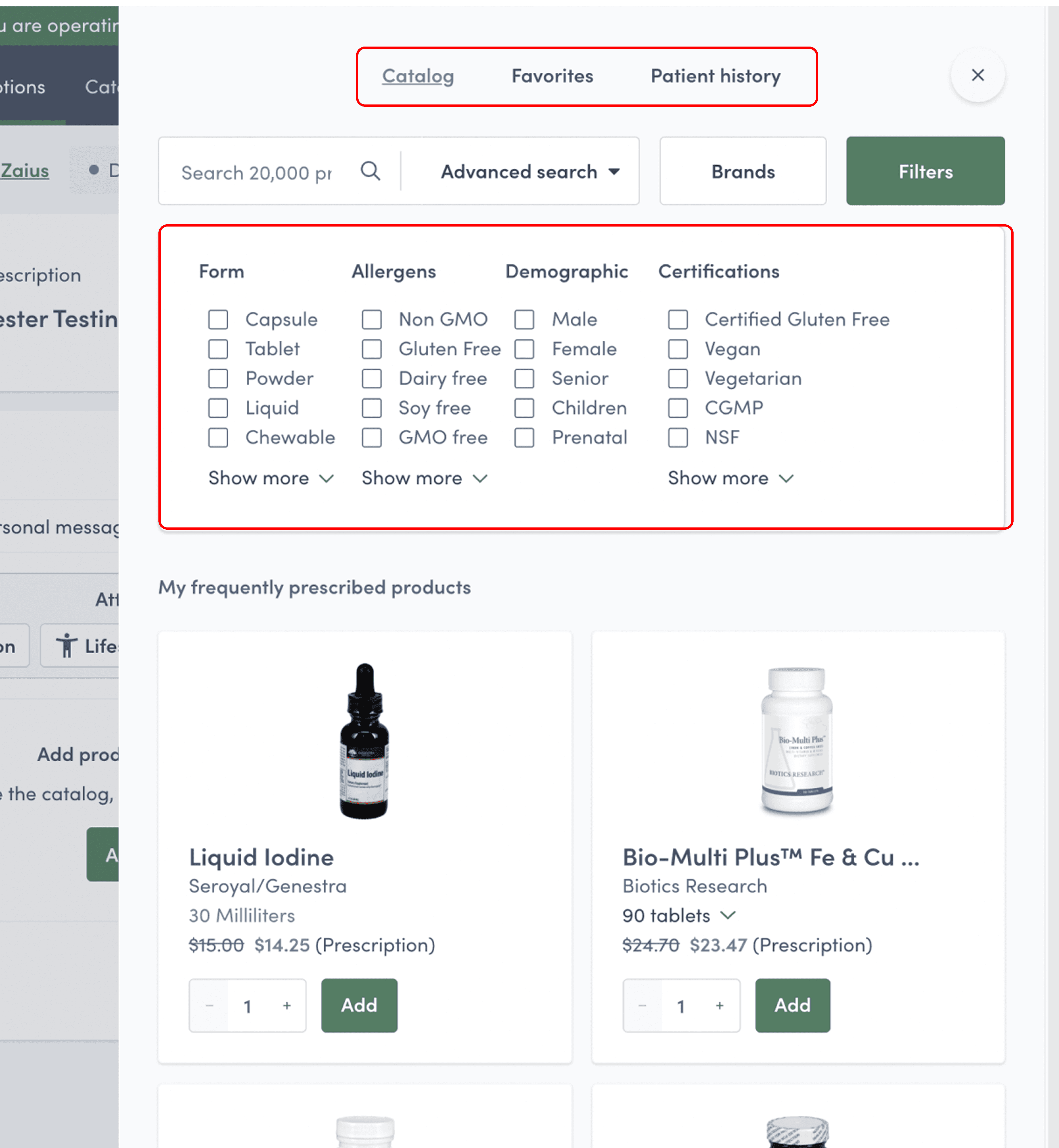
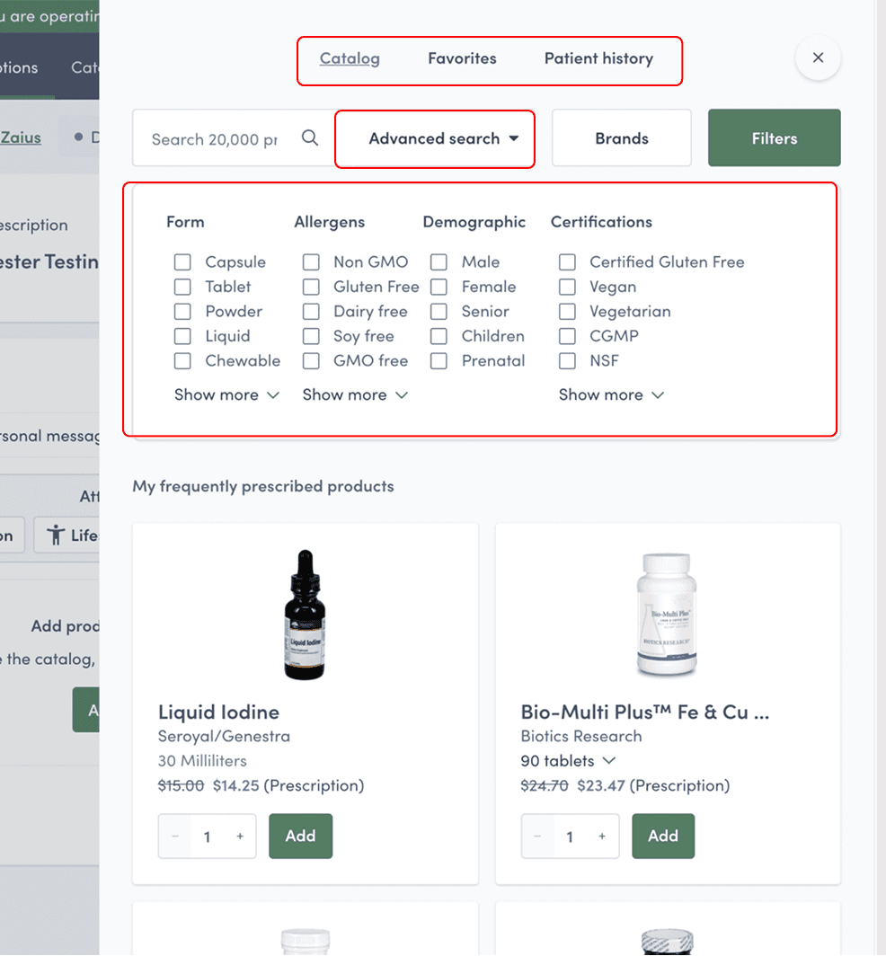
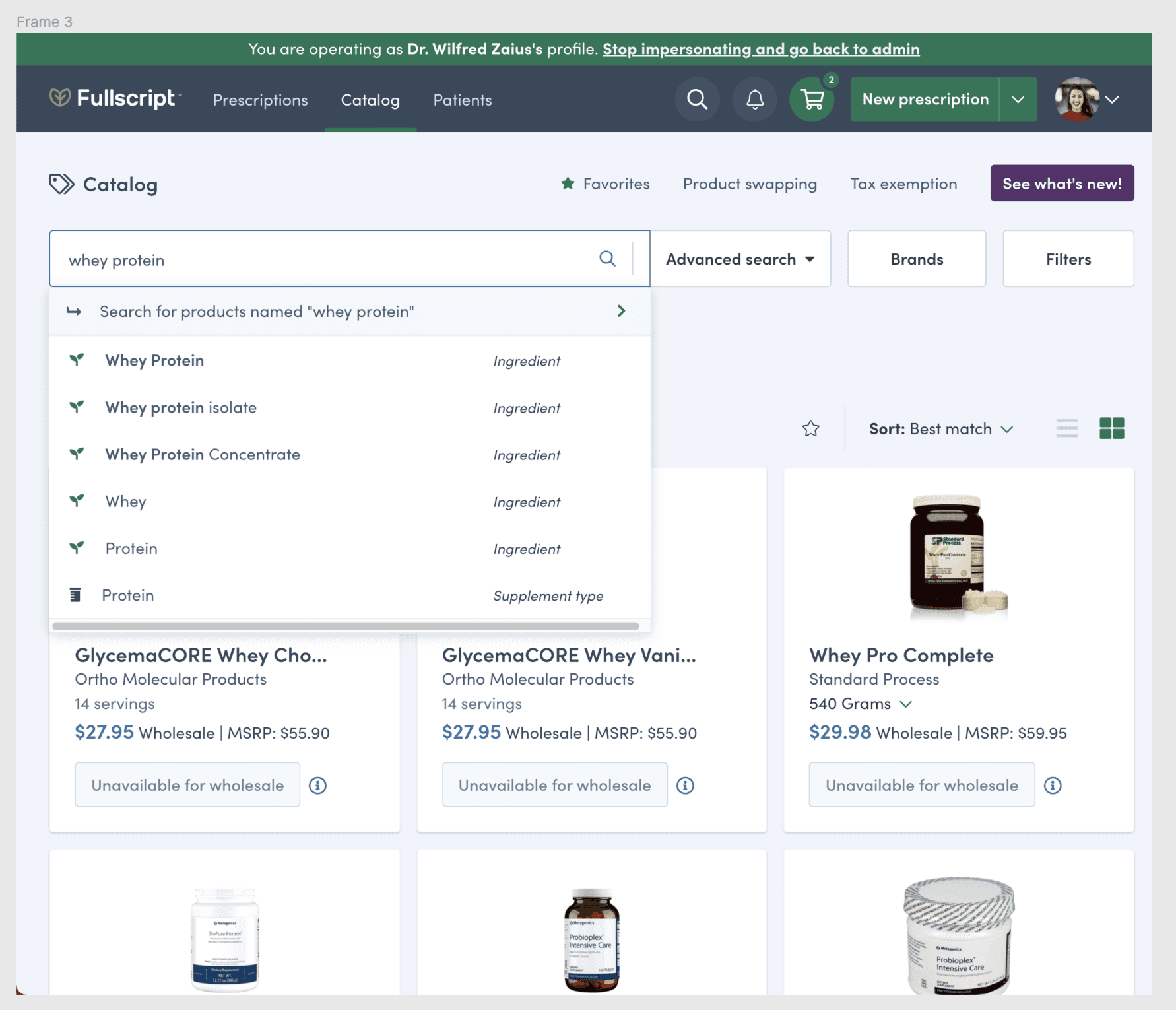
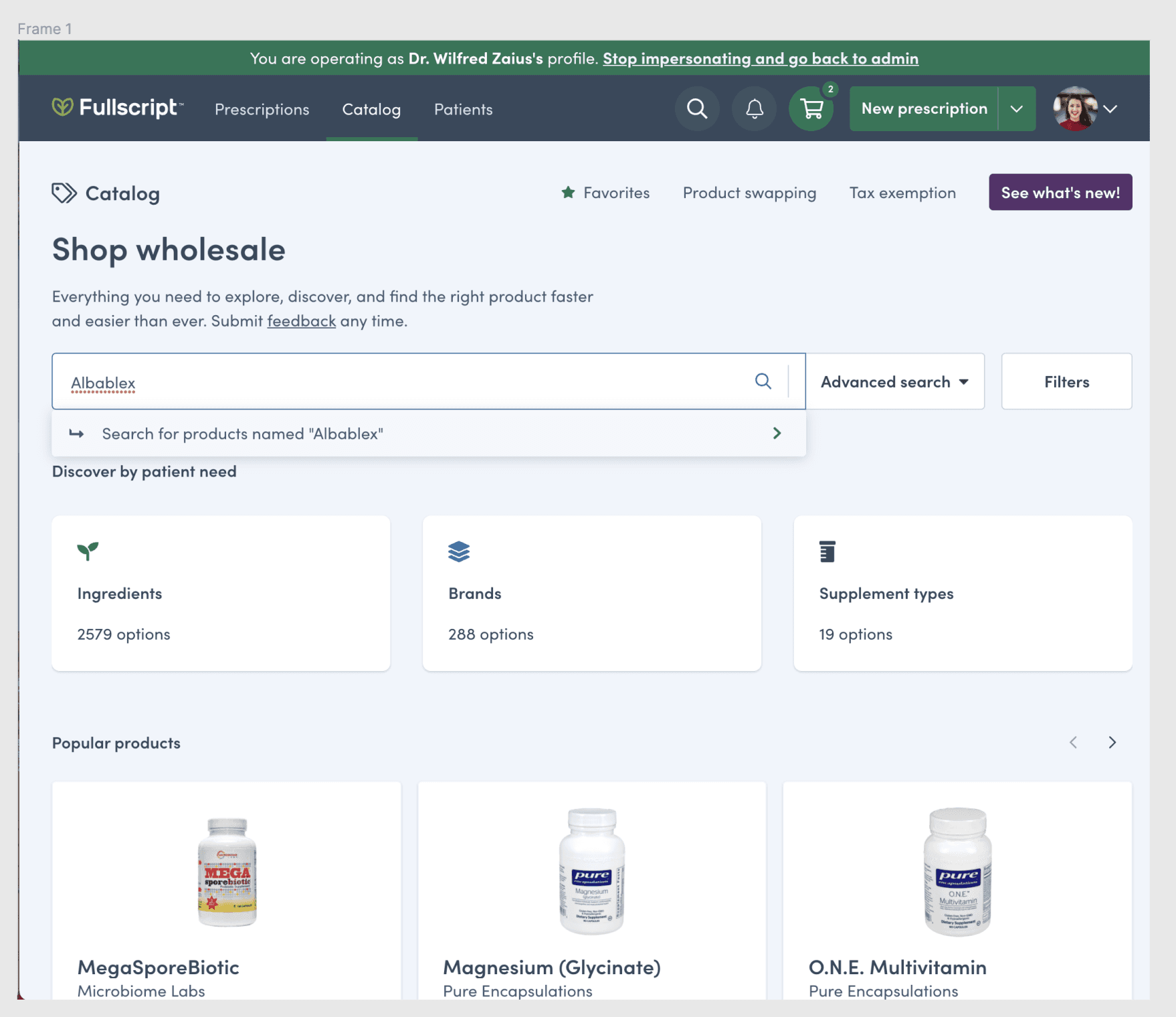
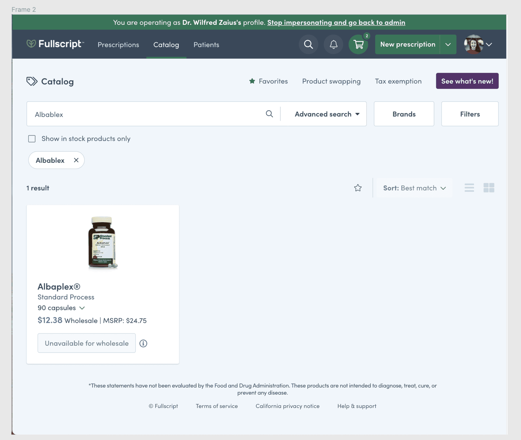
Fullscript’s legacy search was a significant source of customer friction. A rigid keyword-matcher and non-contextual filters led to high exit rates and forced users to seek products elsewhere. I was responsible for rebuilding this discovery pipeline to optimize how users navigated our 20,000+ product catalog.

Challenges

The revenue leak

High-intent patients frequently abandoned their carts because they could not find products known to be in stock.

Operational burden

Search-related support tickets were at an all-time high, creating an unsustainable workload for customer success teams.


Technical debt

We were battling an unstructured database and an inefficient manual product-intake process.


Strategic roadmap

Rather than pursuing a risky 'big bang' redesign, I engineered a phased strategic roadmap. This allowed us to ship immediate UX value to high-intent patients while simultaneously enabling Engineering to refactor the unstructured 20,000+ product database in the background.

Phase 1: From filter fatigue to scalable discovery

Phase 2: From Rigid Utility to Contextual Engine

After

Before

Before

Phase 1: From filter fatigue to scalable discovery

Before

In this phase, I prioritized high-visibility UI fixes to improve findability for power users while we gathered data from a small cohort of experimental users.

Contraints
Horizontal space was maxed out, preventing the addition of new, necessary filter categories.

UX Debt
Non-contextual filters led to thousands of products that were difficult to parse.

Alignment
Tab navigation was floating and disconnected from the user's scanning pattern.

After

After

De-risking through Experimentation
We didn't do a "Big Bang" launch. I advocated for an experimental rollout with a small cohort of users. This allowed us to gather real-world data, iterate on the interaction patterns, and prove the value of the new layout before a full production release.


Solution
In the first phase, I prioritized high-visibility improvements to help users find products faster. I migrated to a dedicated, left-aligned navigation for filtering to ensure long-term scalability and introduced a reusable framework to help engineers build and scale the filter experience.

Phase 1: From filter fatigue to scalable discovery

Constraints

Horizontal space was maxed out, preventing the addition of new, necessary filter categories.


UX debt

Non-contextual filters led to thousands of products that were difficult to parse.


Alignment

Tab navigation was floating and disconnected from the user's scanning pattern.

De-risking through experimentation
We didn't do a "Big Bang" launch. I advocated for an experimental rollout with a small cohort of users. This allowed us to gather real-world data, iterate on the interaction patterns, and prove the value of the new layout before a full production release.


Solution

In the first phase, I prioritized high-visibility improvements to help users find products faster. I migrated to a dedicated, left-aligned navigation for filtering to ensure long-term scalability and introduced a reusable framework to help engineers build and scale the filter experience.

"To solve a problem this deep, I audited the entire ecosystem. I looked at everything from product data ingestion to how different personas mentally categorized supplements."

Thomas Le

Product Designer

Phase 2: From rigid utility to contextual engine

Before

Before

Before

Phase 2: From Rigid Utility to Contextual Engine

After

After

After

Technical debt

The search failed to handle typos or synonyms, leading to high search-exit rates.


Mental model

Results were returned based on system-centric "supplement and ingredient types" that users didn't recognize.


Mobile gap

The search experience was fragmented and lacked parity between platforms.

Solution

While the data was being cleaned, I designed a predictive typeahead system that aligned with how patients actually think about products, rather than relying on technical supplement categories. I proposed a logic that prioritized "product matches" over raw metadata to bridge the gap between user intent and search results.

Cross-platform logic

Solution

While the data was being cleaned, I designed a predictive typeahead system that aligned with how patients actually think about products, rather than relying on technical supplement categories. I proposed a logic that prioritized "product matches" over raw metadata to bridge the gap between user intent and search results.

This work established the foundation for a future pivot to native iOS. By creating a robust component library with platform parity in mind, I minimized engineering friction and guaranteed a cohesive brand experience across all devices.

Conclusion

Conclusion

This overhaul transformed a business liability into a high-performing discovery engine. By moving away from rigid keyword matching toward a contextual, attribute-driven system, we optimized the primary gateway to the catalog. The 90% reduction in support tickets represents a significant gain in operational efficiency and user trust. It proves that deep information architecture is the most effective way to scale user confidence.

This overhaul transformed a business liability into a high-performing discovery engine. By moving away from rigid keyword matching toward a contextual, attribute-driven system, we optimized the primary gateway to the catalog. The 90% reduction in support tickets represents a significant gain in operational efficiency and user trust. It proves that deep information architecture is the most effective way to scale user confidence.

90%

Fewer tickets

Eliminated user frustration by resolving legacy navigation dead-ends.

68%

Conversion lift

Directly attributed to the implementation of guided filtering and predictive typeahead.

82%

Attribute usage

High adoption of the new "Health categories" and "Ingredient" facets, proving successful guided logic.

68%

Conversion lift

Directly attributed to the implementation of guided filtering and predictive typeahead.

90%

Fewer tickets

Eliminated user frustration by resolving legacy navigation dead-ends.

82%

Attribute usage

High adoption of new health and ingredient filters, proving successful navigation of the 20,000+ product catalog.

"What sets Thomas apart is his strategic and systems thinking. He doesn’t just design screens — he understands how decisions connect across the product ecosystem, user journeys, business goals, and technical constraints."

Sarah Donaldson

Staff Product Designer | Fullscript | LinkedIn Recommendations

FAQs

How did you handle the lack of structured data for 20,000+ products?

Why did you choose a phased roadmap instead of a total redesign?

How did you define success beyond the conversion lift?

Let's turn good ideas into great products.

I am a product designer focused on building scalable systems and end-to-end user experiences that drive business growth.

Let's turn good ideas into great products.

I am a product designer focused on building scalable systems and end-to-end user experiences that drive business growth.